37. Text: Groups & Sets
Text Recap of Previous Video
Groups and Sets
Tableau has two different methods for grouping together data, groups and sets. They are similar but have differences I'll go over.
Grouping data points together can help illuminate your message. For instance, if you want to point out the products that are losing money, you'd want to create a group of those products and color them separately from the positive profit products.
Groups
Groups are typically created from the view by selecting multiple data points in the view. For example, I wanted to look at the average quantity sold and average profits for the countries in the data set. You should follow along with me so you can get some experience creating groups and sets.
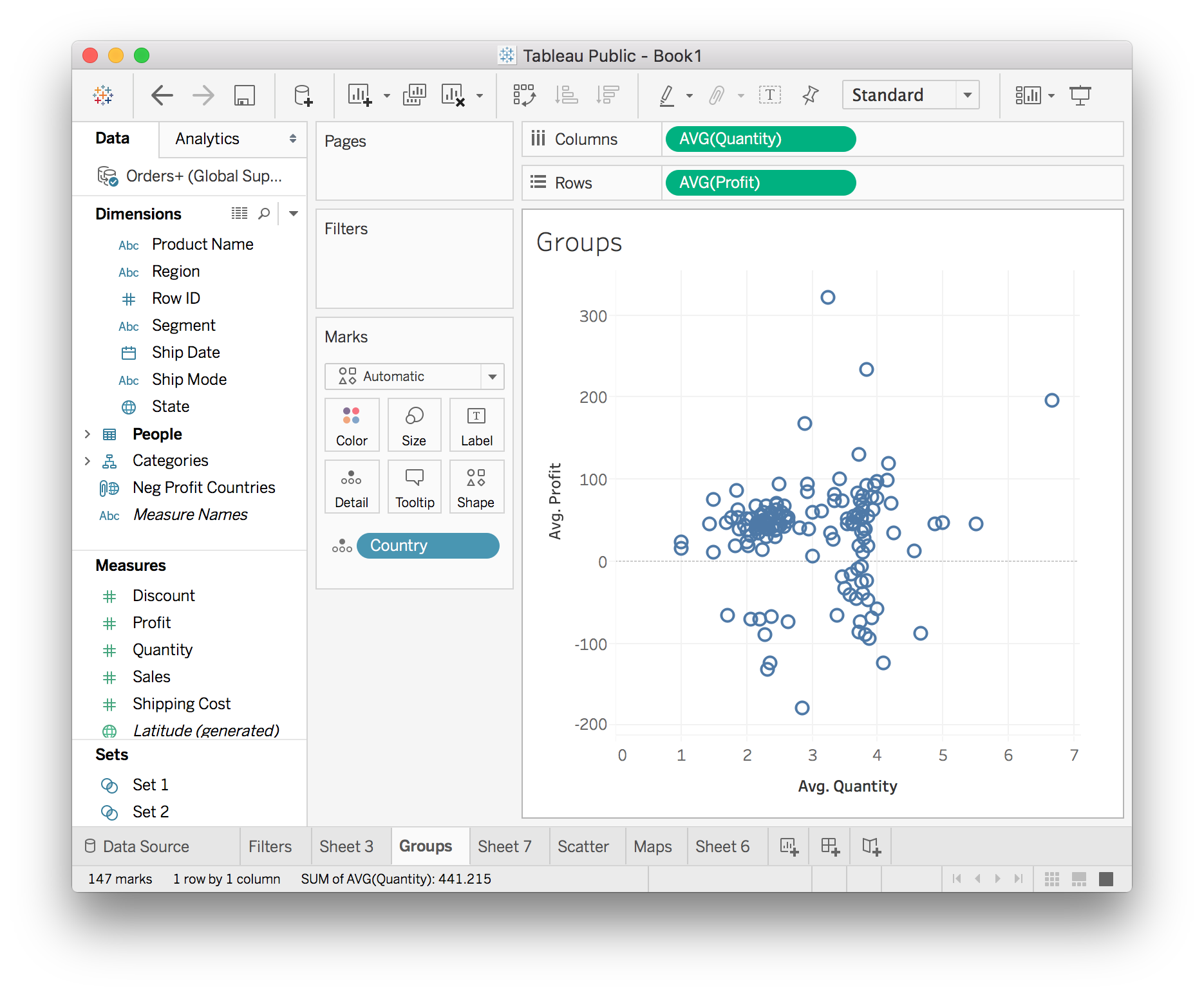
There's something interesting here, it looks like there are two clusters with different average quantities. You can look more into this by grouping together one of the clusters and doing more visualizations. To select the data points with low average quantity, hold down the mouse and drag a box around the left cluster. Then you can either hover over a point and a small menu will pop up, or right click on a data point and a large menu will pop up.
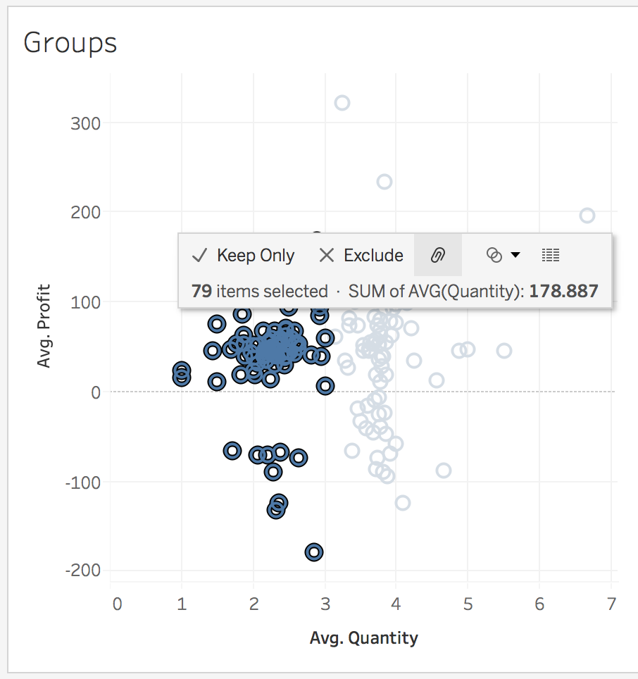
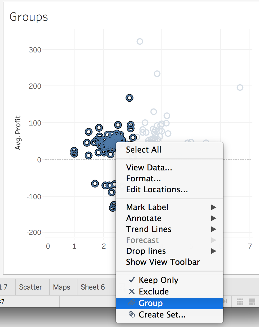
From the hover menu, you can create the group by clicking the link icon (it looks like a paperclip to me). From the right-click menu, select "Group". You should see something like the image below.
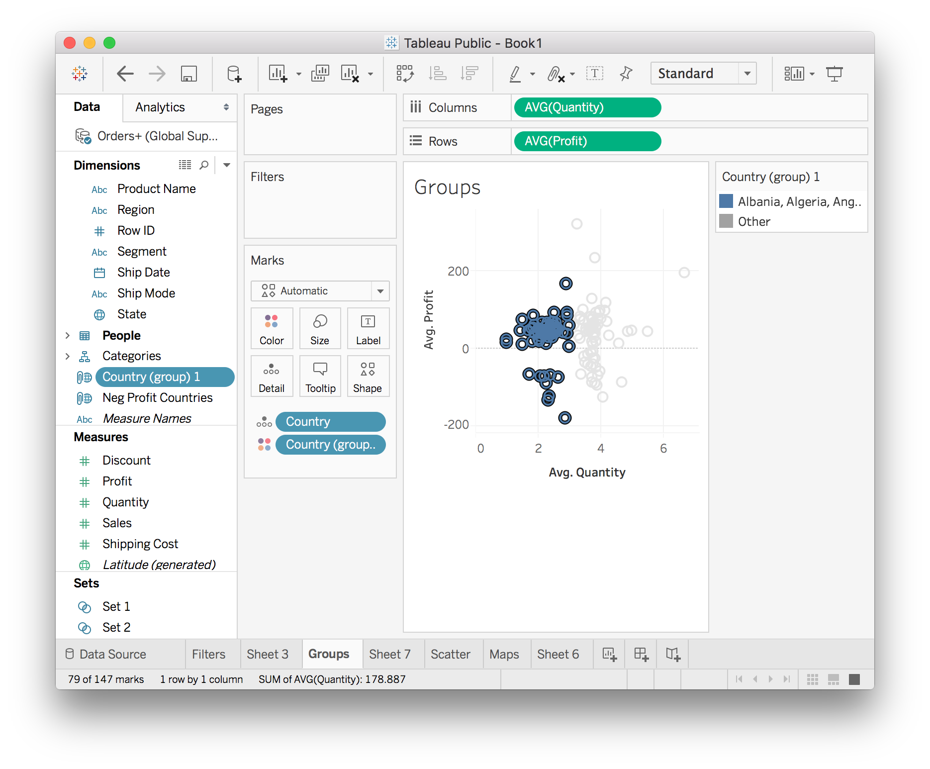
Now there is a group called Country (group) 1, this is the group you just created. I renamed the group to "Low Quantity Countries". The group is really just a list of the countries you selected in the view as you can see below in the "Edit Group" menu.
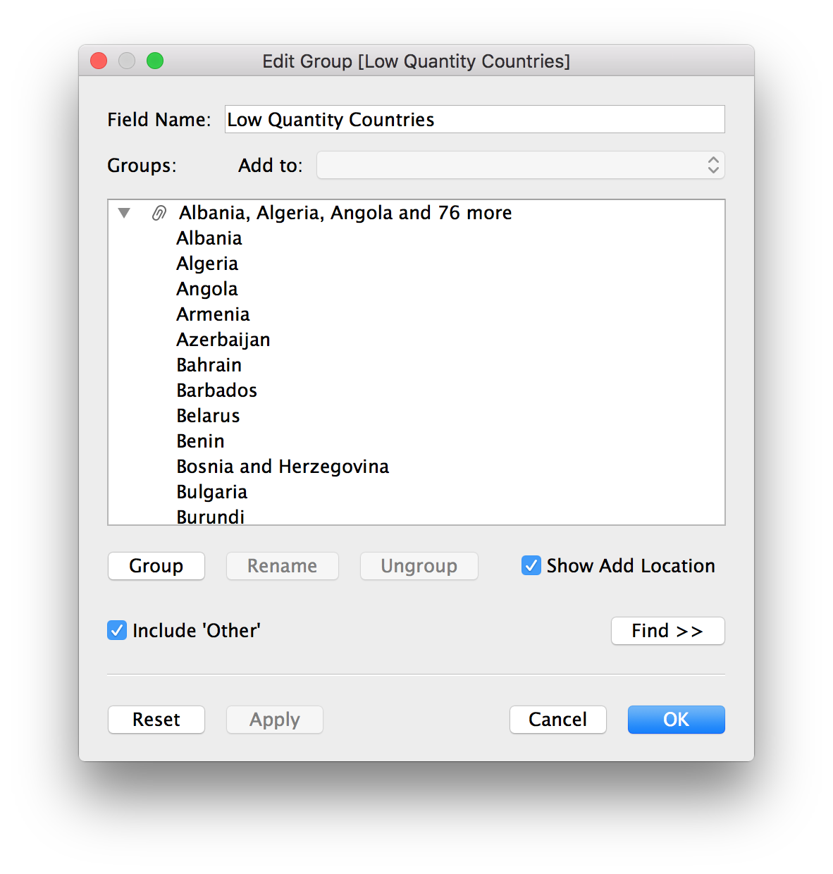
Now that you have the group created, you can use it in other sheets. For instance, create a map that shows how the low quantity countries are distributed in the world.
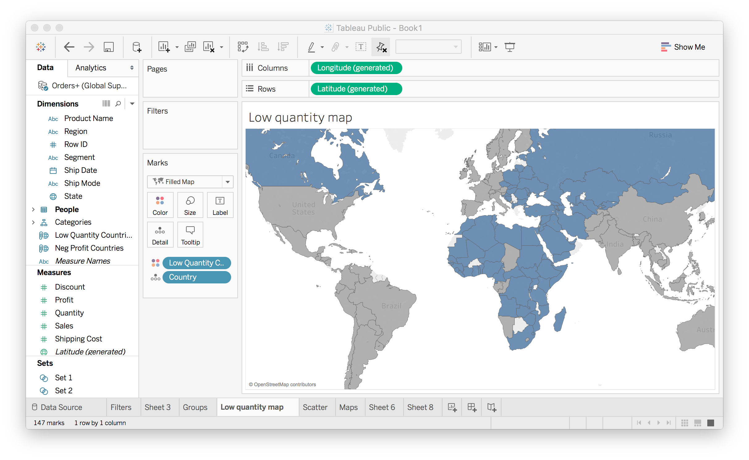
Here I used the group we created (Low Quantity Countries) to color the map. The blue countries are the ones in the group, the ones with low average quantity. It's apparent that most of these countries are in Africa, the Middle East, and Eastern Europe.
Sets
Sets are similar to groups in that you can select data points and create a set from them. However, sets can be dynamic where the members of the set will change as the underlying data changes. Groups on the other hand are static, the members will always be the members.
For example, say you want to see how your poor performing products are affecting the overall profits. You can create a set from the product names or IDs which lose money, where the average profit is below zero. To create the set, open the menu for the Product Name field and choose Create > Set…
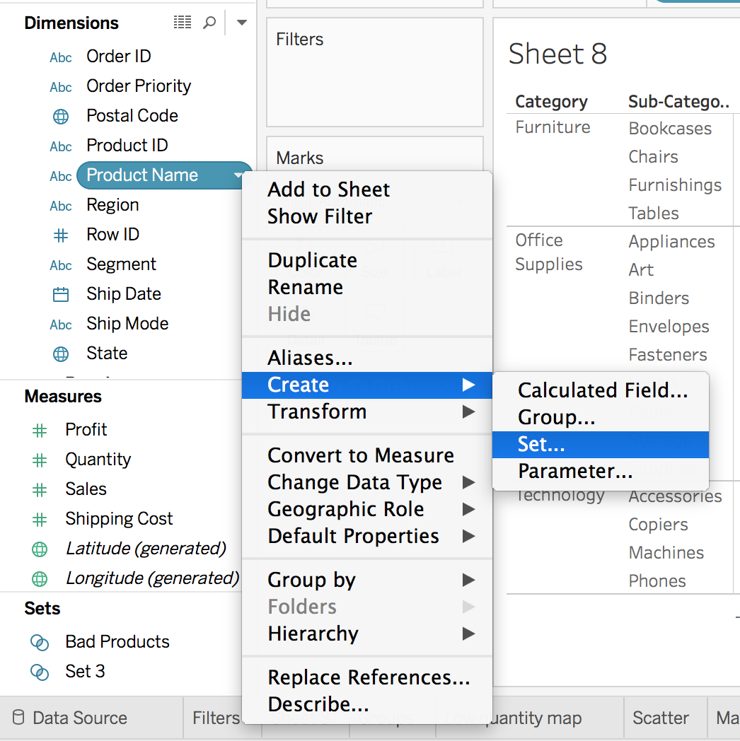
This will bring up the menu for editing a set. Click the "Condition" tab. Then select By field: Profit Average < 0 as seen below.
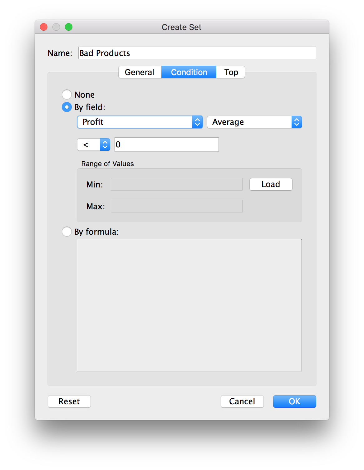
This will create a set of products where the average profit is less than zero. We can use the set in plots to encode these products that are losing money. Let's look at the total profits for the different sub-categories of products.
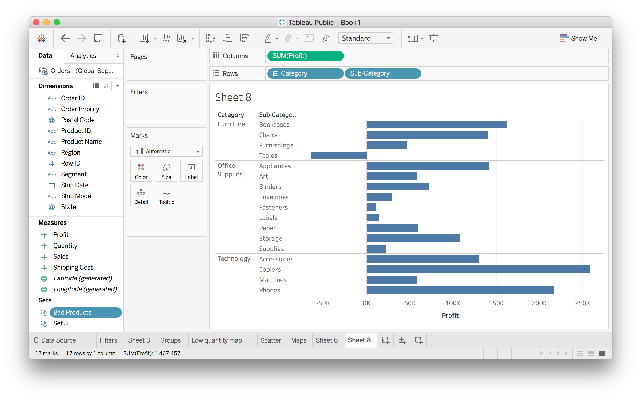
With the set you just made, you can split these bars into losses and gains.
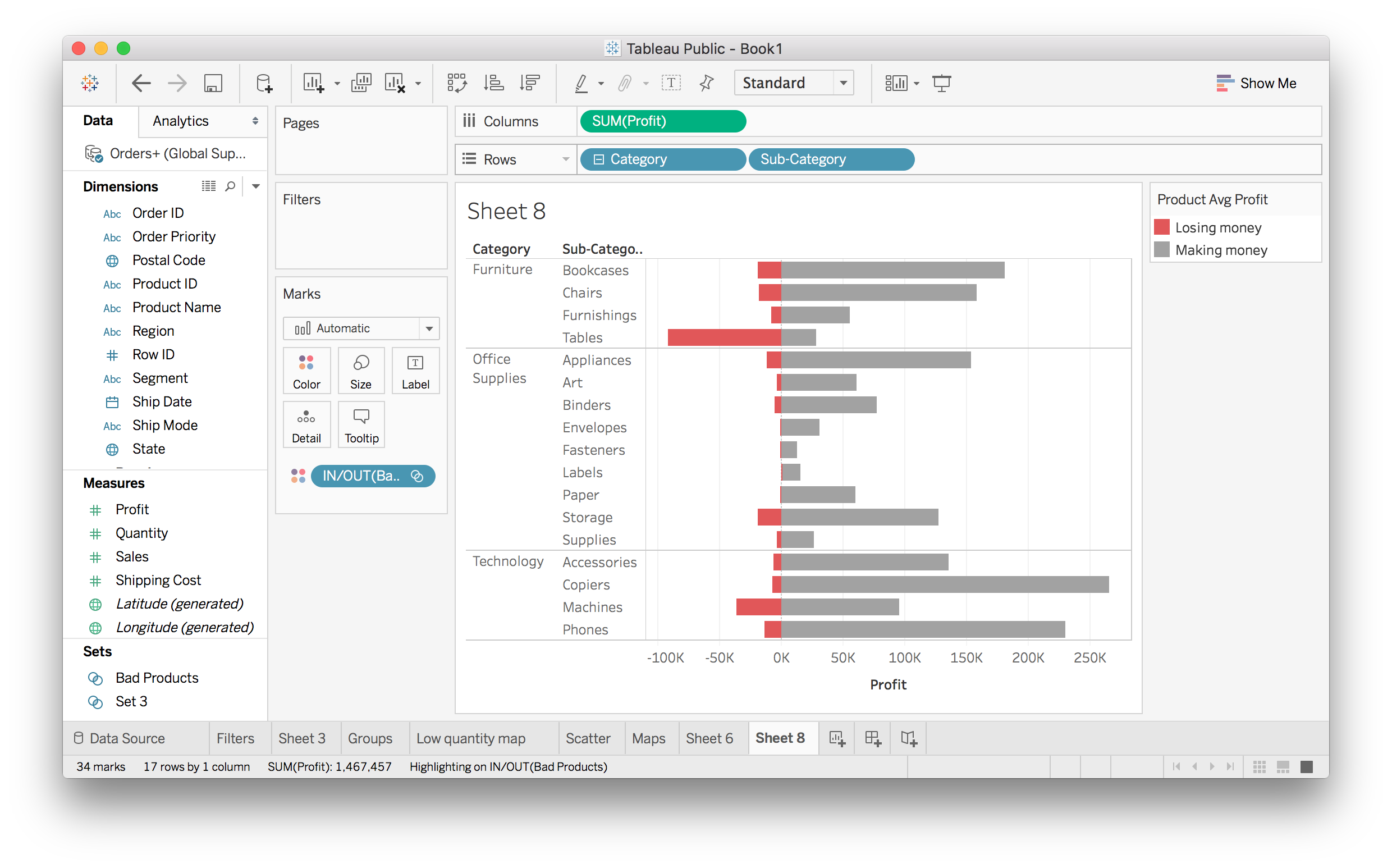
The red bars are showing how much money is lost due to the bad products. It looks like Office Supplies products are almost all winners, but Furniture is losing a lot of money.